
15 Paint Colors That Make a Room Look Bigger for Brighter Interiors
Have you ever walked into a room and felt it looked smaller than it actually is? Bright, spacious interiors are highly sought after, and choosing the right paint colors is a simple yet powerful way to enhance your space.
In this article, you’ll find a variety of paint color ideas that can visually expand your rooms, making them feel airy and open. From subtle neutrals to soft pastels, these colors are perfect for creating a brighter, more inviting atmosphere that transforms your home without any major renovations.
1. Crisp White Walls for a Clean, Expansive Feel
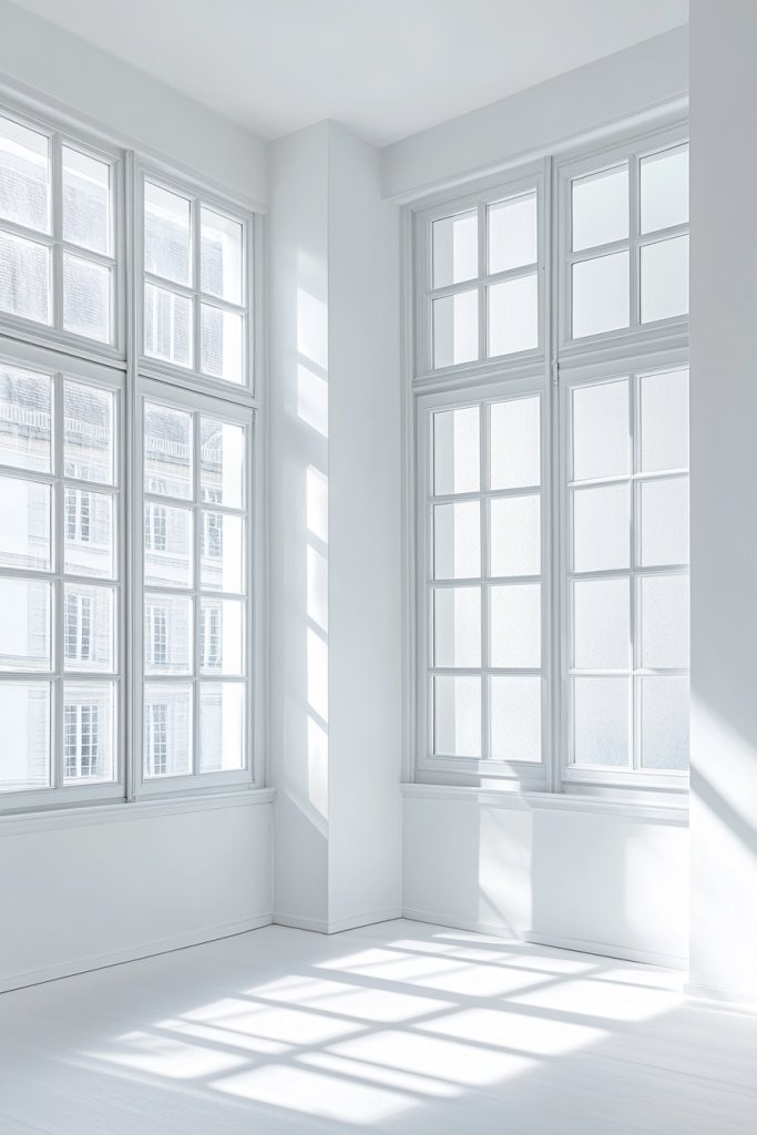
Ever feel like your room is closing in on you, making everything seem cramped and dull? White walls are the ultimate trick to open things up instantly. They reflect light better than any other color, giving your space an airy, clean vibe. Plus, nothing beats the timeless appeal of a crisp white for versatility.
Imagine walking into a room bathed in pure, snow-white walls that bounce sunlight everywhere. The smooth, matte finish creates a seamless backdrop, making furniture and decor pop without overwhelming. The space feels fresh and uncluttered, almost like a breath of fresh air. Even the smallest rooms suddenly seem larger and more inviting.
You can tweak the shade of white—from warm creams to cool tones—based on your lighting and style preferences. In winter, a soft white adds warmth, while in summer, a cooler shade enhances brightness. For a cozy feel, layer with textiles or furniture in neutral shades. Minimalist or maximalist, white works with everything.
Start by selecting a high-quality white paint with good light reflection. Prep your walls by cleaning and repairing imperfections. Use painter’s tape to achieve crisp edges and apply at least two coats for even coverage. Consider a semi-gloss or satin finish for added reflectivity. Lightly sand between coats for a smooth, professional look. Finish with a clear protective top coat if needed.
Add subtle warmth with textured wall panels or a matte finish that softens glare. Incorporate colorful accents through textiles, artwork, or furniture to keep the space lively. For a modern twist, try an eggshell or satin finish that adds slight sheen, catching light beautifully. Layering different textures like linen curtains or woven rugs can amplify the clean, bright vibe.
White walls create the perfect blank canvas for your personality to shine. They make spaces feel bigger, brighter, and more serene. Once you master the basics, you can easily switch up accents to keep your decor fresh and exciting. Ready to transform your space into a sleek, airy retreat?
2. Soft Pastel Blues for Calm, Airy Ambiance
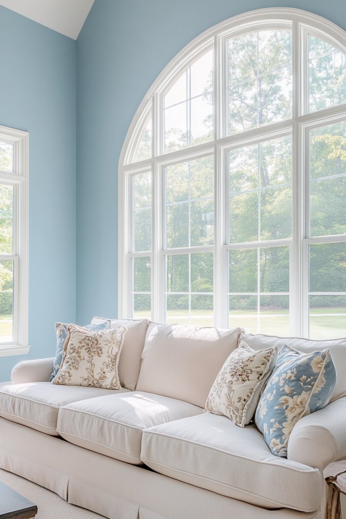
Looking for a color that soothes your mind and makes your room feel more open? Pastel blues are the go-to for creating a calm, breezy atmosphere. They evoke the feeling of a clear sky or gentle ocean waves, instantly making a space feel larger and more peaceful. Who wouldn’t want that?
Picture walls painted in a delicate, sky-inspired shade that catches the light softly. The subtle hue pairs beautifully with white trim or neutral furniture, enhancing the airy feel. Soft blue walls can make even a small bedroom seem like a tranquil retreat. The gentle color adds depth without overpowering the senses, creating a restful environment.
Adjust the saturation of the blue for different moods—lighter for a more ethereal look, slightly deeper for contrast. Incorporate white or beige accents to keep the space feeling open. In coastal or nautical themes, complement with sandy tones and natural textures. For a seasonal change, add warm textiles during winter or keep it minimal for summer.
Choose a pastel blue with good coverage and low VOCs for a healthier home environment. Prepare your walls by cleaning, then apply painter’s tape for sharp edges. Use a high-quality brush or roller to ensure even application. Two coats are usually enough, but assess the coverage after the first. Consider a satin or eggshell finish to reflect light subtly. Allow adequate drying time between coats.
Layer the walls with textured fabrics like linen curtains or a chunky blanket for added softness. Introduce metallic or white accents to brighten the space further. Even adding a few well-placed mirrors can double the sense of openness. Personal touches like framed photos in soft-colored frames can add warmth without clutter.
Pastel blues are classic for a reason—they’re calming and versatile. They help your space look bigger while creating a soothing vibe. Once you see how peaceful your room feels, you’ll wonder why you didn’t try this sooner. It’s a simple switch that transforms your entire environment.
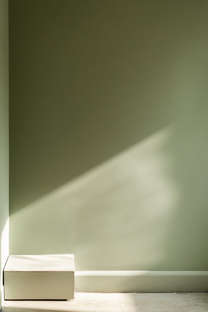
3. Light Gray with Subtle Undertones for Modern Sophistication
Tired of stark white but afraid of dark colors shrinking your space? Light gray with subtle undertones offers a sophisticated middle ground. It’s sleek and modern, yet soft enough to keep your room feeling open. Plus, it’s a neutral that pairs effortlessly with almost any decor style.
Imagine a wall painted in a pale, silvery gray that catches the light differently throughout the day. The understated hue adds depth and dimension, creating a sense of spaciousness. Textured fabrics or matte finishes highlight its modern elegance, while minimalistic furniture completes the look. The result? A room that feels both expansive and polished.
Opt for cool undertones for a crisp look or warmer undertones for a cozy vibe. Complement with black, white, or wood accents for contrast. In contemporary spaces, pair with sleek metals and glass. For a softer feel, incorporate plush textiles or layered rugs in similar tones. Seasonal accessories like throw blankets can add warmth during winter.
Select a high-quality gray paint with low sheen for a modern finish. Prepare your walls thoroughly—clean, sand, and patch any imperfections. Use painter’s tape for clean edges and apply with a roller for smooth coverage. Two coats are generally sufficient; wait for each to dry fully. Consider a matte or eggshell finish to reduce glare and enhance the subtlety of the color. Use a primer if your walls are darker or stained.
Add visual interest with textured wall panels or subtle geometric patterns. Incorporate metallic or glass elements to reflect light and add a luxe feel. Keep accessories minimal but impactful—think sleek vases or modern sculptures. Use lighting wisely; indirect lighting can emphasize the depth of the gray and make the space feel larger.
Gray is the ultimate neutral that screams sophistication without sacrificing openness. It creates a refined backdrop that makes your decor stand out. Once you see your space transformed, you’ll feel more confident experimenting with other modern hues. It’s a timeless choice for a reason.
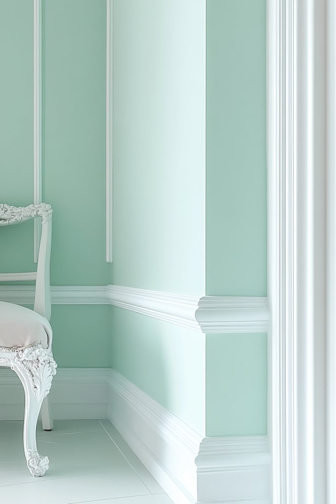
4. Pale Mint Green for Fresh, Bright Interiors
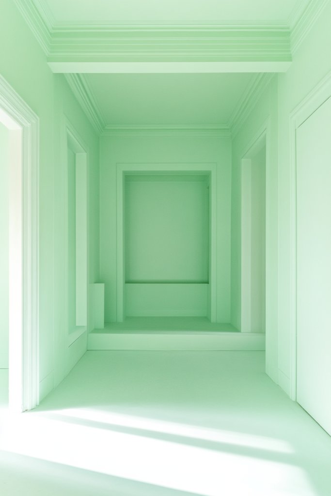
Craving a color that feels refreshing and energizing but still calming? Pale mint green hits that sweet spot perfectly. It’s lively enough to brighten your space and subtle enough to keep it feeling open. Ideal for those who want a touch of nature inside without overwhelming the senses.
Visualize walls in a soft, pastel mint that reflects natural light beautifully. Pair it with crisp white trim or warm wood furniture for contrast. The gentle hue makes small rooms feel airy, almost like a garden in bloom. Textured fabrics or woven accents enhance its organic, fresh vibe. The overall effect is invigorating yet soothing.
Adjust the intensity of mint for different moods—softer for a more subdued look, brighter for a lively feel. Use natural materials like rattan, linen, or cork to complement the fresh aesthetic. During spring and summer, add botanical accents for a cohesive theme. During cooler months, layer with cozy textiles to maintain warmth.
Choose a high-quality, low-VOC paint in a pale mint shade. Prepare your walls by cleaning and priming if necessary. Use painter’s tape for crisp edges and a roller for even coverage. Two coats are usually enough; let each dry thoroughly. A matte or eggshell finish works well to diffuse light and add softness. Avoid overly glossy finishes that can make the color seem brighter than intended.
Personalize with textured throws, soft rugs, or layered curtains in complementary shades. Incorporate natural wood or wicker furniture to enhance the organic feel. Consider adding mirrors to reflect light and amplify the space. Small decorative elements like mint-colored cushions or ceramics can tie the look together.
Pale mint green is a cheerful choice that lifts spirits and enlarges your space visually. It’s a versatile hue that works across styles, from modern to boho. Once you experience how lively and open your room feels, you’ll be inspired to experiment further. Freshness is just a coat of paint away.
5. Warm Beige or Cream for Cozy Yet Spacious Rooms
Want a color that makes your room feel inviting but still spacious? Warm beige or cream offers that perfect balance. It’s neutral enough to serve as a backdrop and warm enough to create a cozy atmosphere. The best part? It makes your space look bigger without feeling cold or sterile.
Imagine walls painted in a soft, buttery beige that reflects natural light warmly. Pair it with textured textiles like a chunky knit throw or woven rugs for added warmth. The color complements wooden furniture and metallic accents, adding sophistication. The overall look is welcoming and open, like a hug you can walk into.
Choose lighter or darker shades within the beige spectrum based on your space and lighting. Layer with contrasting textiles or art in richer hues for depth. During winter, add cozy blankets and plush cushions. In summer, keep the decor light and airy to maintain the spacious feel.
Pick a high-quality, low-VOC paint in a warm beige or cream tone. Prepare your surface by cleaning and repairing any imperfections. Use painter’s tape for clean edges and roll on two coats, allowing ample drying time. Satin or eggshell finishes work well to reflect light subtly. Consider a primer if painting over darker walls for even coverage.
Introduce textured wall coverings or decorative molding for added interest. Use soft textiles in complementary shades—think plush cushions or cozy curtains. Incorporate metallic or wooden accents to add warmth and contrast. Small details like picture frames or decorative trays can personalize the space further.
Warm beige and cream create inviting environments that feel larger and more open. They blend seamlessly with any decor style, from rustic to modern. Achieving this look boosts confidence in your ability to craft a welcoming, airy space. It’s a timeless choice everyone can love.
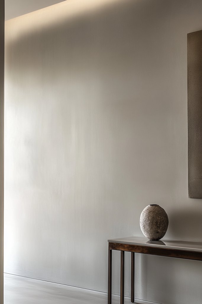
6. Soft Taupe for Elegant, Understated Brightness

Looking for a sophisticated color that doesn’t scream but still enlarges your space? Soft taupe offers understated elegance with a bright twist. It’s perfect for creating a calm, spacious atmosphere that feels refined. If you want a versatile hue that works with almost anything, taupe is your friend.
Picture walls in a gentle, warm gray-brown that blends into the background while adding depth. The matte finish absorbs light, making the room feel larger without harsh glare. Decor in muted tones or metallic accents complements taupe beautifully, creating a subtle but impactful aesthetic. The overall ambiance is one of quiet sophistication.
Select taupe shades with cool or warm undertones depending on your lighting and mood. Pair with soft textiles like velvet or linen for a luxe feel. Use contrasting accents like black, white, or gold to elevate the look. During different seasons, swap out textiles or accessories to refresh the ambiance.
Choose a high-quality taupe paint with a matte or eggshell finish for a soft glow. Prepare walls by cleaning and filling any holes or cracks. Use painter’s tape for sharp lines and apply two coats, waiting for each to dry fully. Consider a primer if covering darker or stained walls for even color. Lightly sand between coats for a smooth surface.
Add textured wall panels or fabric wall hangings for subtle interest. Use metallic or ceramic decor items to add a touch of luxury. Incorporate layered textiles like throws and cushions to add depth. Small decorative objects or art in complementary shades personalize the space further.
Taupe’s understated elegance makes any space feel larger and more refined. It’s a timeless choice that blends with various styles, from contemporary to traditional. Once you see your room’s quiet sophistication, you’ll be inspired to explore other subtle hues. Confidence comes easy with a versatile, chic color like taupe.
7. Light Lavender for a Subtle Pop of Color and Depth
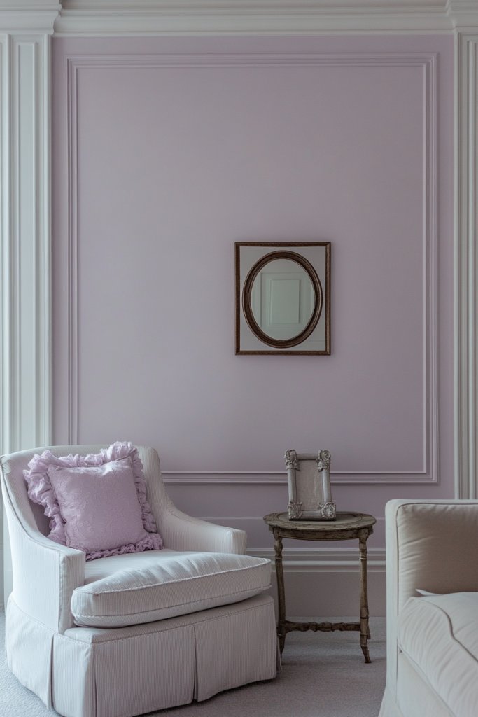
Want to add a hint of color that feels calming but doesn’t overpower? Light lavender provides a soft, sophisticated touch that enlarges your space visually. It’s perfect for creating a gentle, tranquil environment that still feels lively. Who says you can’t have a little color and still keep things spacious?
Envision a room with walls in a delicate lavender hue that catches the light softly. The muted tone blends seamlessly with whites and greys, adding depth without closing in the space. Accents in silver or mirrored surfaces amplify the light and create a luminous effect. The overall vibe is airy and refined, perfect for a bedroom or lounge.
Adjust the intensity of lavender for different atmospheres—lighter for serenity, slightly deeper for a hint of elegance. Pair with crisp whites or soft greys to keep the room feeling open. Incorporate reflective surfaces or metallic details to bounce light around. Seasonal accents like plush cushions or curtains can refresh the look.
Select a high-quality, low-VOC lavender paint with a matte or satin finish. Prepare walls by cleaning and priming for smooth application. Use painter’s tape for clean edges and apply two coats with a roller. Allow ample drying time; light sanding between coats can improve smoothness. Consider subtle sheen finishes to catch light and emphasize the color’s depth.
Layer with textured fabrics, like velvet or linen, in complementary shades. Use decorative mirrors or shiny accessories to reflect light further. Incorporate metallic or glass elements for a modern touch. Small decorations like lavender-scented candles or framed photos in purple hues personalize the space.
Light lavender is a versatile, calming color that makes any space look larger and more sophisticated. It’s a subtle way to introduce personality without sacrificing openness. Once you see how peaceful and expansive your room feels, you’ll be motivated to experiment more with gentle hues. Trust the power of a soft lavender.
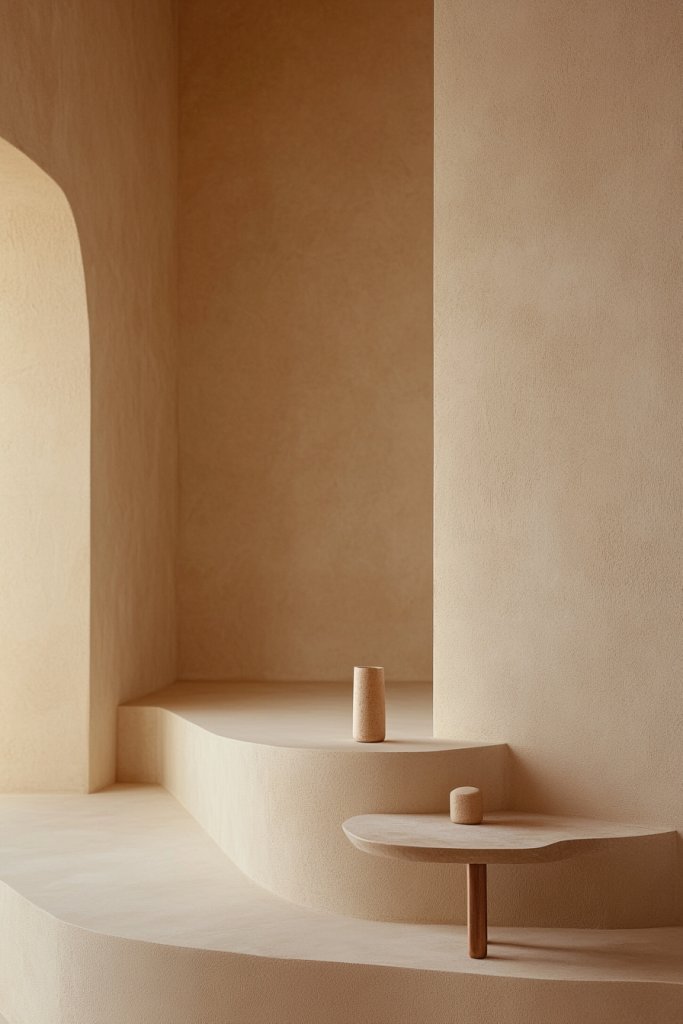
8. Pale Sandy Tones for a Natural, Spacious Feel
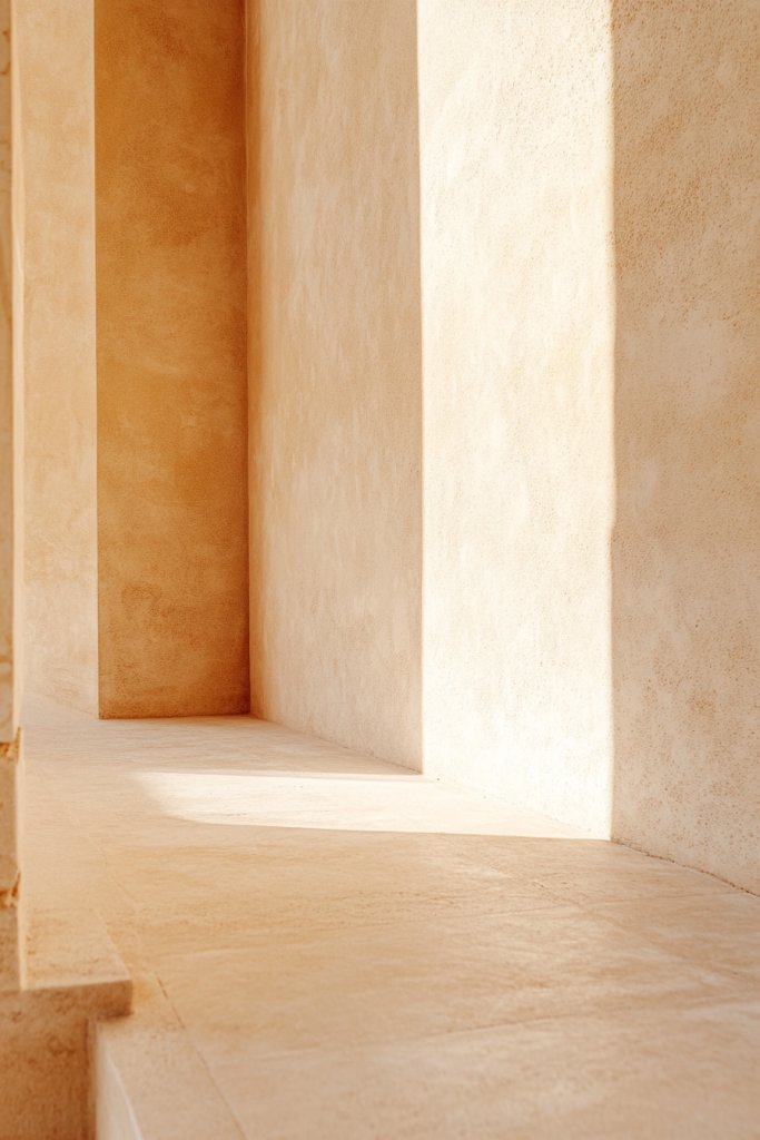
Craving a color that feels organic and enlarges your space at the same time? Pale sandy tones bring the outdoors in, creating a natural, open environment. They work wonderfully to reflect light and add warmth without making a room feel crowded. Who knew earthy hues could be so expansive?
Visualize walls in a gentle, sandy hue reminiscent of a sunlit beach or desert landscape. The matte finish absorbs light, giving the room a soft, glowing quality. Pair with natural textures like wicker, linen, or wood furniture to amplify the earthy vibe. The overall effect is calming, spacious, and inviting.
Adjust the shade from light beige to warm tan depending on your lighting and style. Incorporate textured textiles or layered rugs in similar tones for depth. During summer, add breezy curtains and light furniture; in winter, layer with plush throws and rugs. The neutral palette adapts easily to different decor themes.
Choose a high-quality, matte or eggshell finish paint in sandy tones. Prepare your walls by cleaning thoroughly and patching any imperfections. Use painter’s tape for crisp lines and apply two coats for even coverage. Allow each coat to dry completely; lightly sand between coats for a flawless surface. Consider a primer if covering darker or stained walls.
Add natural elements like woven baskets or textured textiles to enhance the earthy look. Incorporate decorative wood accents or ceramics in similar tones. Layer with different textures and materials for visual interest. Small details, such as neutral-colored cushions or textured curtains, personalize your space.
Pale sandy hues evoke tranquility and expand your space visually. They blend effortlessly with various styles, from coastal to rustic. Achieving this look boosts confidence in creating a serene, spacious environment. It’s a subtle yet powerful way to refresh your home.
9. Cool Aqua Shades to Enhance Openness and Freshness
Want a color that screams freshness and makes your room feel larger? Cool aqua shades are just the ticket. They evoke the feeling of crisp water or a refreshing sea breeze, instantly enlarging the space visually. If you love a vibrant yet calming vibe, this hue is perfect.
Imagine walls in a lively, cool turquoise that catches the light and reflects a spectrum of blues. The glossy or satin finish enhances the aquatic feel, giving your space a vibrant, energized look. Pair with white trims and sleek furniture for a modern, spacious feel. Add a few metallic accents to reflect more light and elevate the vibe.
Adjust the saturation from bright turquoise to softer sea foam for different moods. Complement with sandy or white accents to keep the space feeling open. Incorporate glass or acrylic decor to amplify the luminous effect. Seasonal accents like light textiles or airy curtains keep the space feeling fresh year-round.
Choose a high-gloss or semi-gloss aqua paint for a vibrant finish. Prepare walls by cleaning and priming for smooth application. Use high-quality brushes or rollers to avoid streaks and ensure even coverage. Apply at least two coats, allowing each to dry thoroughly. Consider a waterproof or washable finish for durability in high-traffic areas.
Add textured textiles like silk or linen in complementary shades. Use reflective or metallic decor to bounce light and create visual interest. Incorporate modern, sleek furniture and accessories in neutral tones. Small details like aqua-colored cushions or decorative ceramics personalize the look.
Cool aqua shades energize your space and make it feel larger and more vibrant. They work well in coastal or contemporary designs, adding a splash of freshness. Once you see your room energized and bright, you’ll be motivated to explore more bold hues and finishes.
10. Pale Olive Tones for a Subtle, Spacious Green
Craving a color that feels natural and expands your space at the same time? Pale olive or sage tones bring a calming, green touch that makes rooms feel larger and more inviting. They’re perfect for blending indoors with nature’s calming influence. Who doesn’t want that?
Picture walls in a muted olive that reflect light softly, creating a soothing atmosphere. Pair with natural textures like wood, linen, or jute for an organic feel. The subtle green adds depth without overwhelming, making the space seem more open and fresh. Accents in white or beige keep it light and airy.
Adjust the shade from soft sage to muted olive based on your lighting and mood. Use natural materials and textures to complement the green tones. Incorporate plants or botanical motifs for a cohesive look, or keep it minimal for a modern vibe. Seasonal accessories like cushions or throws can add variety.
Select a high-quality, low-VOC paint in pale olive or sage. Prepare your walls by cleaning and patching. Use painter’s tape for clean edges and apply two coats, allowing each to dry thoroughly. A matte or eggshell finish diffuses light softly, emphasizing the tranquil vibe. Primer may be necessary if covering darker colors.
Decorate with textured textiles, woven baskets, or natural fiber rugs to enhance the organic feel. Use light-colored or metallic accents to add subtle contrast. Incorporate small botanical or nature-inspired decor items. Mirrors can help reflect light and increase the perception of space.
Pale olive tones connect your indoor space with nature, enlarging and calming the environment. They are versatile enough to suit various decor styles, from boho to minimalist. Seeing your room feel more open and peaceful will inspire you to explore more natural palettes.
11. Light Champagne or Ivory for Opulent, Bright Rooms
Want a color that radiates luxury and makes your space look bigger? Light champagne or ivory shades bring a luminous, elegant glow that enlarges rooms effortlessly. They create an opulent, timeless backdrop perfect for any decor style. Fancy without the fuss?
Imagine walls in a warm, luminous ivory that reflects daylight beautifully. The subtle sheen of champagne or ivory adds a touch of glamour, especially when paired with metallic accents. The reflective quality amplifies natural and artificial light, making everything feel more open. Luxurious textures like silk or velvet further elevate the ambiance.
Choose shades from soft cream to golden champagne depending on your lighting and mood. Combine with gold or brass accents for a rich look, or keep it simple with white or beige accessories. Layered textures and fabrics in similar tones add depth without cluttering the space. Seasonal updates with richer textiles can refresh the look.
Pick a high-quality, luminous paint with a subtle sheen. Prepare walls meticulously—clean, repair, and tape for crisp edges. Two coats usually suffice; allow each layer to dry completely. A satin or eggshell finish enhances the glow and reflects light softly. Use a primer if your walls are darker or stained for uniform color.
Incorporate reflective decor like metallic frames, mirrors, or glossy furniture to amplify the luminous effect. Use layered lighting—chandeliers, sconces, or soft LEDs—to enhance the opulence. Add plush textiles or textured wall coverings in complementary shades to add richness. Personal touches like framed art or decorative trays complete the look.
Light champagne and ivory hues make your rooms feel brighter, larger, and more luxurious. They serve as a classic, versatile choice that elevates your decor instantly. Once you see how spacious and radiant your space becomes, you’ll be eager to experiment with other sophisticated neutrals. Confidence in elegant simplicity is within reach.
12. Soft Sky Blue for an Inviting, Open Atmosphere
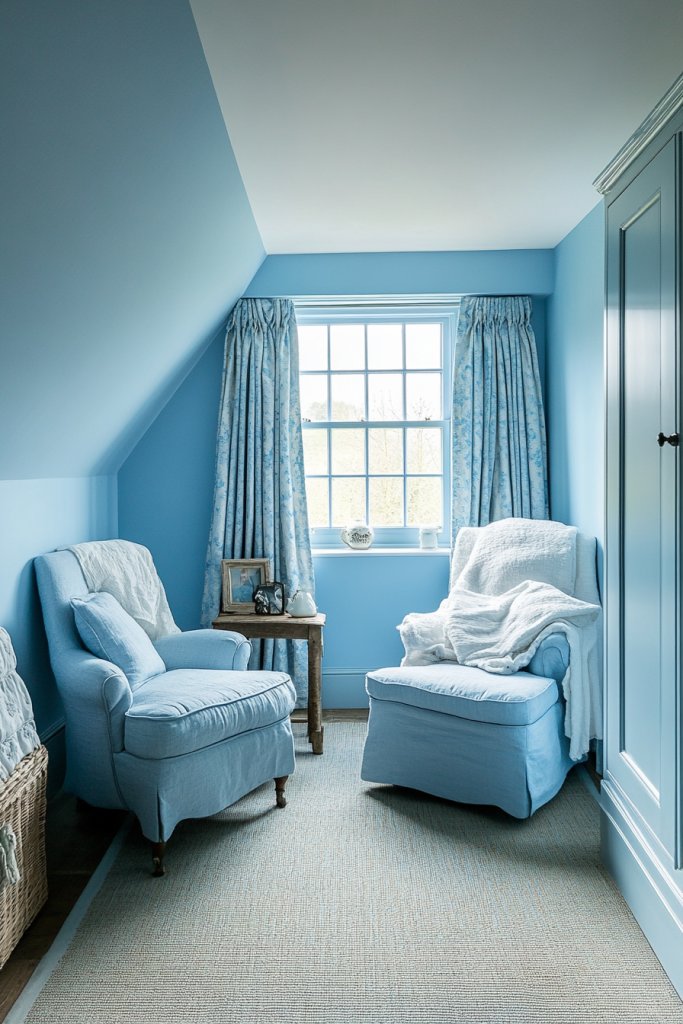
Seeking a color that brings the outdoors inside and makes your space feel bigger? Soft sky blue offers a calming, inviting vibe that visually expands any room. It’s like a breath of fresh air that instantly relaxes and enlarges your environment. Who wouldn’t want that?
Envision walls painted in a gentle, sky-inspired hue that reflects light in a soothing way. Pair it with crisp white or neutral furniture to enhance the airy feel. The subtle blue creates depth and dimension, especially when combined with reflective or shiny surfaces. The result? A peaceful retreat that feels limitless.
Adjust the tone from pale blue to a slightly deeper hue for different moods. Incorporate white or light wood accents for contrast and brightness. Use textured fabrics or layered textiles to add warmth and comfort. Seasonal tweaks like cozy throws or light curtains keep the space fresh year-round.
Choose a matte or satin finish in a soft sky blue. Prepare your walls by cleaning and patching imperfections. Use painter’s tape for clean lines and apply two coats, allowing each to dry thoroughly. Consider a semi-gloss finish for a slightly more reflective effect that enhances the color’s luminosity. Primer may be necessary if covering darker shades.
Add textured textiles like linen or cotton to increase visual softness. Use mirrors or reflective decor to bounce light and amplify the open feel. Incorporate furniture in natural tones or white to keep the space light. Small decorative items like cushions or art can personalize your tranquil retreat.
Soft sky blue creates a serene, expansive environment that feels both fresh and calming. It’s a versatile hue that fits many decor styles, from coastal to minimalist. Seeing your room open up and brighten will inspire you to explore more calming colors and create your own peaceful sanctuary.
13. Light Lemon or Citrine for Bright, Energizing Interiors
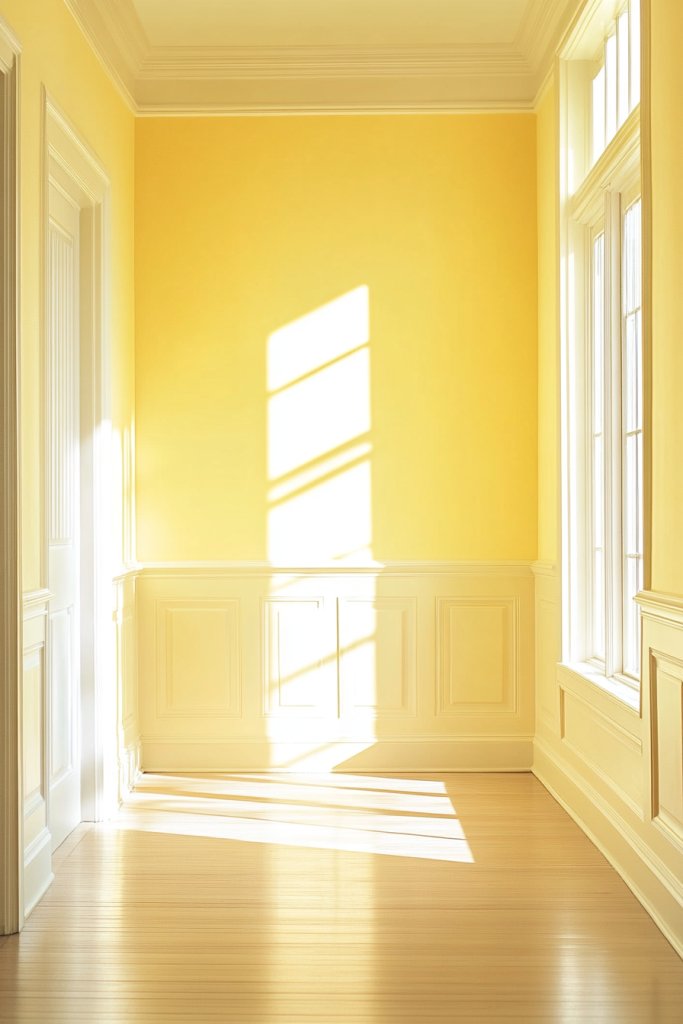
Want to energize your space and make it seem bigger at the same time? Light lemon or citrus tones bring a cheerful, luminous vibe that enlarges rooms visually. They add a splash of sunshine that lifts spirits and opens up your environment. Who says vibrant colors can’t be spacious?
Imagine walls in a sunny lemon or bright citrine that reflect light vividly. Pair with white or neutral furniture to keep the space feeling fresh and open. The cheerful hue creates a lively atmosphere, perfect for kitchens or living rooms. Adding shiny or reflective accessories enhances the bright, energetic feel.
Adjust the shade from soft lemon to vibrant citrus for different effects. Combine with white, grey, or natural wood accents for balance. Incorporate textured textiles or layered curtains in complementary shades. Seasonal updates with colorful cushions or throws can keep the look fresh.
Choose a high-quality, washable paint with a satin or semi-gloss finish for a lively shine. Prepare your walls by cleaning and patching. Use painter’s tape for sharp edges and apply two coats, waiting for each to dry thoroughly. Consider a primer if covering darker colors or stains for even brightness. Finish with a protective clear coat if needed.
Add accents like yellow or citrus-colored decor, shiny ceramics, or metallic details to reflect light. Incorporate textured textiles such as linen or silk for a luxurious touch. Use reflective surfaces like glass tables or metallic frames to amplify the luminosity. Personal touches like vibrant cushions or artwork make the space uniquely yours.
Bright citrus hues energize your space and make it feel more expansive and cheerful. They’re perfect for creating lively, welcoming environments. Once you experience how energized and open your room feels, you’ll be inspired to experiment with bold, sunny shades. Brighten your life—literally!
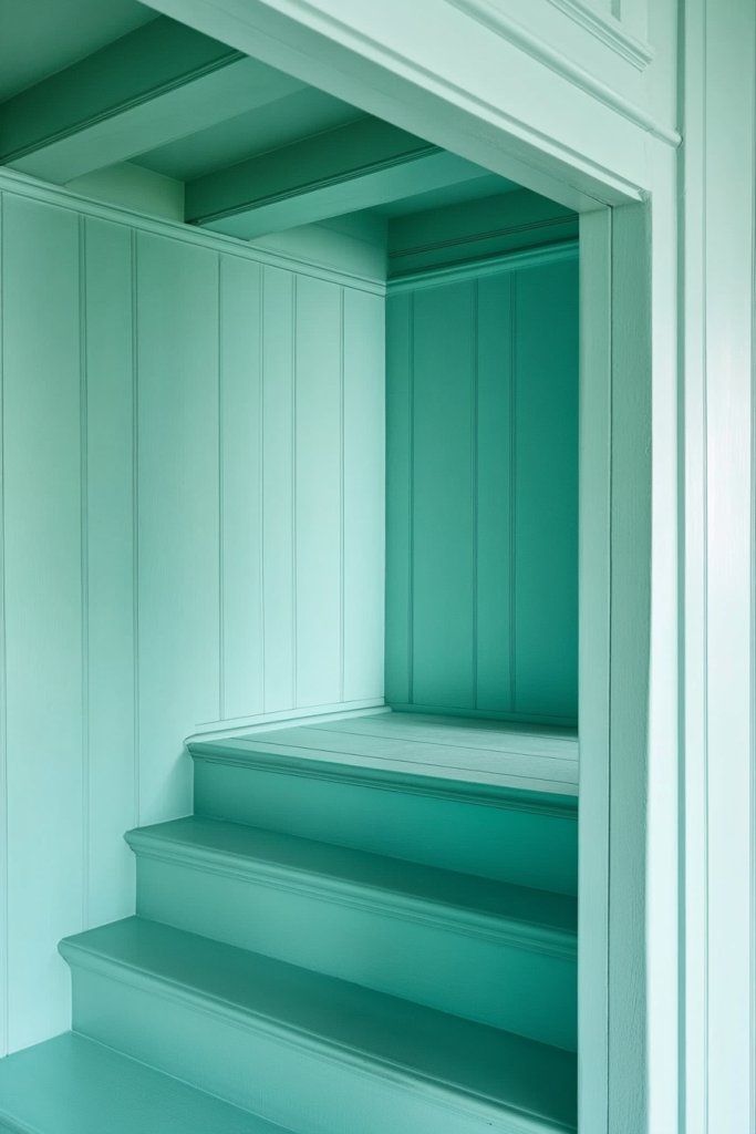
14. Cool Mint with White Accents for Fresh and Spacious Decor
Looking for a fresh, clean color palette that makes your space feel larger? Cool mint paired with white accents offers a crisp, airy vibe that enlarges rooms effortlessly. It’s perfect for those who want a modern, refreshing look with a touch of nature. Ready to breathe new life into your home?
Picture mint green walls with white trim and ceiling, reflecting light and creating a vibrant, open environment. Incorporate white furniture or textiles to enhance the freshness. The cool hue adds depth while keeping the space bright and lively. Accentuate with textured fabrics or subtle metallic decor for a polished finish.
Adjust the mint’s saturation from soft pastel to slightly deeper shades for different moods. Use layered textiles and textured wallpapers in white or matching shades for added interest. Incorporate natural materials like wood or rattan for a harmonious look. Seasonal updates can include lightweight curtains or plush throws.
Select a high-quality, low-VOC paint in a refreshing mint shade. Prepare walls by cleaning and priming. Use painter’s tape for sharp edges and apply two coats, allowing each to dry completely. Finish with a matte or eggshell finish for a soft, diffused light. Consider a primer if covering darker or stained surfaces.
Add textured textiles, decorative cushions, or layered curtains in whites and mint for depth. Use mirrors to reflect light and amplify the fresh feel. Incorporate modern or natural decor items to keep the look crisp and inviting. Personal touches like framed art or small sculptures can make it uniquely yours.
Cool mint with white accents creates a vibrant, spacious atmosphere that feels fresh and modern. It’s a versatile hue that fits many decor styles, from coastal to contemporary. Seeing your space feel larger and more energized will motivate you to explore similar fresh palettes. Freshness is a game-changer.
15. Subtle Greige (Gray-Beige) for Versatile, Room-Enhancing Walls
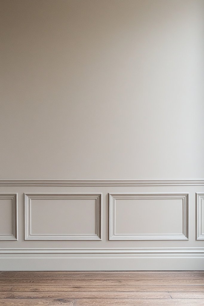
Want a neutral color that makes your room look bigger without sacrificing style? Greige— a blend of gray and beige—offers a sophisticated, versatile backdrop. It’s perfect for creating a spacious, calming environment that complements any decor. Ready to elevate your space effortlessly?
Imagine walls in a warm, muted gray-beige that reflect light softly, adding depth without overwhelming. The subtle tone pairs beautifully with both cool and warm accents. Incorporate textured fabrics or layered textiles to enhance the cozy, expansive feel. Mirrors and metallic details amplify the light and add elegance.
Adjust the balance of gray and beige depending on your lighting and mood—lean more toward gray for a modern edge, or beige for warmth. Use complementary decor in whites, blacks, or metallics for contrast. Seasonal accents like cushions or throws in rich textures can refresh the look. Keep furniture and accessories simple.
Choose a high-quality, low-VOC greige paint with a satin or eggshell finish. Prepare your walls by cleaning and repairing. Use painter’s tape for sharp lines and apply at least two coats for even coverage. Allow each coat to dry thoroughly; lightly sand for a smooth finish. Primer may be necessary over darker or stained walls.
Layer with textured fabrics, decorative throws, or wall coverings in warm or cool tones to add interest. Use reflective decor such as metallic or glass items to bounce light. Incorporate sleek, modern furniture or classic pieces for a balanced look. Small decorative objects in contrasting colors personalize the space.
Greige is a timeless, adaptable neutral that enlarges and elevates any room. Its subtle sophistication makes your space feel more expansive and refined. Seeing your home transform into a stylish, open environment will boost your confidence in experimenting with neutral palettes. It’s a smart, elegant choice.
Conclusion
Exploring different shades that make your space appear larger can truly revolutionize your home environment. Whether you opt for calming neutrals or light pastels, these paint ideas are versatile and easy to try. Embrace these options and watch your rooms become more open, luminous, and welcoming—your brighter, bigger home awaits!